Friday, April 18, 2025

Random Collection of post modern "Art"

 Ok so first I couldn’t decide what I wanted to do for this time period simply because it is so large and the evolution of so many styles of art begins during and after WWII and all of the stuff I really want to talk about kicks off in the mid to late 80s and I figured that while interesting is to far away from WWII to be relevant for the selected period. So I decided to not have a focus on any specific issue or style and just picked three great artists and some of their pieces that I just like to look at. Those artists and works including the great Stan Lee and my favorite character Spider-Man, the Corvette line-up made by Chevrolet, and finally old Sci-Fi.

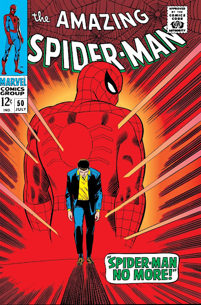
Spider-Mans fall

                    The Amazing Spider-Man: Spider-Man No More Spider-Man No more #50 

                                            By Stan Lee and John Romita April, 1967

This piece artistically is giving the view of the suite and the duty within wearing that suite. The strong red color is overwhelming and draws out Peter's own clothing and forces it onto him. The way his shoulders and body language is slumped down showing just how much the world has weighed down on him. The use of light coming off the suite as Peter's own shadow stretches out before him. All are elements establishing just how much sits on the characters shoulders and how over time that weight can truly ruin a person. Comic book covers have always read like pieces of propaganda from the world wars as they are meant to be added for the comic. Yet this cover plays such a strong role in establishing in the reader's mind what Peter's life has been like that if it wasn’t that cover image the story would lose a sense of dread as you read it. I also enjoy how well it plays with the image down below that shows petters own view as he is walking away from the responsibilities held within the suite.

If I were to have a painting or poster done of this piece it would feel more appropriate to have it a museum of the character and have it amongst other comics of Spider-Man being the successful hero that most know him for being. One of those pieces that stands strong is Spider-Man's series that oftentimes doesn’t so forcefully confront the reader what living the life of a superhero truly means.


                            The Amazing Spider-Man: Spider-Man No More #50 

                                    By Stan Lee and John Romita April, 1967 


Artistically having the blue tones of the background with the rain falling and having Peter Parker walking towards that rain without the protection of the suit stands out strongly. This Panel is set near the back of the comic and plays a good contrast to the red of the cover as well as showing that this is Peter Parker's own viewpoint on the world around him. Having the sky sitting so filled in and close to his head with the rain clouds establishes where he is at mentally. With that use of space masterfully showing how crammed full he feels his life is and just how overwhelming that is.

If I were to own this piece it would be interesting to have it poster size but it would need to be mixed in with a set of other heroes falling or giving up the mask to truly give it that sense of end. However I believe that within the comic it is such an amazing piece for it being part of a comic book series.

This is one of the first times that we do see the super hero Spider-Man give up the suit and the story goes through Peter Parker's want to be done protecting the city as no matter how much he does and how many times he gets back into the fight it just doesn’t get any better for him. It was one of the most iconic moments for the character as Spider-Man has always been seen as the hero that no matter what, he will do whatever he can to get back in the fight and to protect the people of his city. Thus him giving up the suit that has been torn up by battle and his time being Spider-Man shows just how much the character has been broken at this point in his current story. 

To me personally spider man has always been this character of absolute will power that no matter what goes and does what he believes to be the right thing. He has been that younger superhero for me that I felt has always been more relatable to me as well when compared to the bigger names like Superman and Batman. I believe that comes from where his life remains at all times during the comics, i.e. his early 20’s, and his set attitude towards life. That attitude being all about keeping up a light hearted and joyful time as he protects what he holds dear. Yet Spider-Man's life is one of the worst you could possibly live and a phrase that is often used when talking about the character is “No good thing will ever happen to Spider-Man” or a more relevant one “if Spider-Man is happy, turn two pages”. He is the character that the writers every time think of some new and more imaginable way to ruin his life over and i think that why him finally giving up the suit is so important to me specifically. No matter how much he had been through before this moment there was still what felt like a hope for his life to turn at some point or that good day was just on the horizon. Yet here stands Spider-Man the superhero who fights through all of life's problems, finally breaking and giving up that self-inflicted response ability.


The Corvette


Next I want to talk about a piece of art that not many people think about when it comes to art. That being the design of the StingRay C2 Corvette and the following C3. Cars that in my mind scream hop in and come race us.


Corvettes originally entered the market in 1953  as Chevrolets two door two seat roadster. The car meets the market initially with bad market feedback as the style in which the car is set up turns off the luxury car buyers and those looking for speed simply aren’t even looking at it as a reasonable option. The rounded corners and bubbly nature turn off many people looking for a speedier car and so for the next5 years the car simply is looked over and not thought of among most crowds. The company finally looks into making the model into a serious sports car in 1956 when they drop a 4.3 liter V8 under the hood and a change to the camshaft giving it a better spring when going at higher speeds, this is what starts to grab the common person's attention when they are looking for high performance cars.

C1 produced in Flint Michigan 1953-1957

Designers Harley Earl and Bob Cadaret


This car takes a twist on the British style of sports and luxury cars with the  high wheel wells, the bubbly front and the greatly rounded body. It's a car transitioning away from the classical lines while still keeping to its roots and that is one of the major reasons that it did so poorly in the small American market they were looking at at the time. There was nothing new or profound about a slow performance car that looked just as bubbly as all the others out on the road or the track.

However this is not the design I believe should and does stand tall when most Americans think of  the Corvette design. That claim goes to the hard top model C2 better known as the Sting Ray.


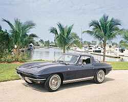
C2 (StingRay) 1963-1967 GM Flint Michigan

Designers Larry Shinoda and Anatole Lapine


This car screams speed and sharpness to me. It's one of the first American made designs that looks properly loud, fast and cool enough to make good on that American made branding Chevrolet held at the time. Inside the car was originally a 5.4 L V8 and later in life it held a 7 L V8 big block engine. The extended hood and shift to the drivetrain allowed for the engine much more room to spread weight and power to the rear wheels with a newly built and designed chassis to give it the aerodynamics a performance car should have. The body lines are set for the best known use of aerodynamics in the car world at the time and it starts setting the precedent for how American performance cars should and would to start looking through the 60’s and early 70’s

This car is when GM decides that it wants to and finally has the money to come and play in the racing scene with the big boys in Europe and go on to win a GT Le Mans 24 hour race trophy. This car sets Chevrolet as a high end performance division of General Motors and starts to truly bring in the money that hadn’t come in with its earlier brother.

If i were to own one of these it would for sure be getting its own garage built and i would be buying some of the most absurd parts to throw under the hood. No questions asked, it doesn't belong in a museum or as a showpiece in someone's house but out on the road flashing by as fast as it can go.


C3 (Stingray) 1968-1976 GM St. Louis Missouri

Designers Gm & Chevrolet design teams, Zora Arkus-Duntov chief engineer, Bill Mitchell Chief

stylist

The C3 screams to me that it belongs on the race track. Gone is the odd line from the hood to the driver's seat. Gone is any subtlety that this car was made for anything but going fast. The lights sealed away into the hood to not take away the resting speed it has just sitting on the pavement. The rear end sits out wide giving it that weight and power to drive you forward down the road. The extended hood and wide front tires calling for you to look and wonder just how large that engine is sitting under there. The tire wells that had been made smaller in the C2 raised and sharpened to show it's not afraid to show its British roots. The line works down the middle of the whole car serving as its own metal racing stripe that any paint would dull in comparison. The C3 is speed.

This car is not my favorite simply because it's the inspiration for my favorite performance car the Nissan Fairlady. The Stingray is so out there saying look at me that it would be hard to get in this car and feel like i didn’t have to show off and go fast. I know that sitting in that steering wheel with that hood stretching out before you with all its fun secrets inside just telling you to see what it has in store for you must feel amazing. It's one of my reasons for loving the 70’s and the 80’s as much as I do simply because cars were coming onto the scene with some of the sharpest lines and coolest designs. painting them feels as if you're completely ruining the form that the car in solid gives you. I simply don’t know what it is other than the boys and cars that make this look so beautiful but I think that's all that it takes.

If I were to own this car I would be spending way too much money on performance upgrades and speeding tickets as I drove it as fast as I could across the United States and back. There is no other way in my mind to own this car.


Old Sci-Fi

The sci-fi Scene of the 70s begins to show its own twist on the modern styles of art with the abstractism provided by many artists of the era with a mix of the fantastical that is gained and thought of when it comes to the older versions of sci-fi.

There is an absurdity to what the Sci-Fi artist of the time were doing as no rules had been set out for what would sell, what was considered outside of the norm, and what was too weird to appeal to the masses. So oftentimes many science fiction stories would have covers made by a person who was on a hard psychedelic and had just read a story about some make believe reality. Thus we get pieces like


Sentinel 

By Ray Feibush for scientific monthly 1975


Sometimes there are pieces of old sci fi that feel so absurd and abstract that you can barely make heads or hands of it. I think that is the reason why I like Sentinel so much compared to the other types of Sci-Fi works out there as there is the simplicity of it. While there is still some messaging with the faceless people wandering in front of the jade warrior it reminds me of so many Sci-Fi elements that it fits together so smoothly. I mean the first thing I thought upon seeing it was that I didn't know Americans knew about Gundam's. Gundam's being some of the most popular giant fighting mechs in Japan, Yet the artist most likely saw pictures of terracotta warriors, add in a mix of alien planet and giant with some city of the damned thought process and you get this mix. A giant jade warrior holding a city on top of its head guardian from some far off unknown. It's that unknown that is my favorite part about older Sci-Fi because it feels like a branch of creativity that hadn’t yet been stifled by tropes other genres had at the time, like high fantasy and lord of the rings.

If I had this piece I would have it set up next to either a bookcase full of old Sci-Fi books, or it would be set with a few spaceships in front of it adding to the whole alien world vibe it has going on.

Davis Meltzer's cover to Lord of Thunder

By Andre Norton 1975


I chose this piece because it was on the same site as the Sentinel and it gets my point across that old Sci-Fi art could literally be anything mixed into a world jumble. And I love it. Like how in the world do you describe this to an artist without sounding absolutely wild like here's the only way i can think that it would go.

Hey I have this book about space and a dud in a green suit who controls thunder. Can you set him in front of a spacey detection thing that can look like it was meant to be n-on a submarine? Oh. make sure you can see his eyes. What color? Definitely yellow and green. What does his hair look like? He's in his green suit so of course he doesn't have hair. Oh and make sure he's holding his thunder power, and don't forget the metal snakes he's got two of them.


Like how else do you get this weird assortment of wild character and background with clearly refined boot outlines. It just is like a perfectly strange depiction of that old style of Sci-Fi to mee. 

If i were to place it anywhere it would either be far away from someone doing drugs or close to someone doing drugs depending how bad of a trip there is cause who knows what they'll come up with for these pieces.


Bibliography


Fink, Greg. “The Chevrolet Corvette’s Complete History, from C1 to C8.” Car and Driver, Car and Driver, 3 July 2018, https://www.caranddriver.com/features/g22035705/fully-vetted-the-visual-history-of-the-chevrolet-corvette/

“The Strange, Surreal, Visionary Sci-Fi Art of the 1970s.” CrimeReads, 29 Aug. 2023, c .https://crimereads.com/the-strange-surreal-visionary-sci-fi-art-of-the-1970s/

Wikipedia Contributors. “Chevrolet Corvette (C2).” Wikipedia, Wikimedia Foundation, 6 Nov. 2019, en.https://en.wikipedia.org/wiki/Chevrolet_Corvette_(C2)


Wikipedia Contributors. “Chevrolet Corvette (C3).” Wikipedia, Wikimedia Foundation, 6 Nov. 2019, en.https://en.wikipedia.org/wiki/Chevrolet_Corvette_(C3)

Marvel.com, 2018, https://www.marvel.com/comics/series/1987/the_amazing_spiderman_1963_1998


Friday, April 4, 2025

Americas Great War Propaganda

Propaganda and Americas Usage    

    Propaganda is a form of art that I find to be one of my favorites especially when it gets to the World Wars. Before the World Wars propaganda had been often depicted in black and white format and was especially popular in newspapers and pamphlets. This is especially true in Europe as they were either downplaying the colonies or it was being used as a form of expression on their rival countries or the inner workings of their own politics. However there is a change in propaganda around the first world war. Not only stylistically, but with the messaging being used by the governments themselves. Some of the pieces that got stronger support by the governments would also go on to later influence how countries often view themselves  today.

    American propaganda holds a level of variety that the nations involved with the war from the start. This is due in large part due to the disconnection that America had with the war itself as much of it was being fought in Europe and the colonies which those countries held. So America had to push hard to gain public support for the war, and to get over that hurdle of an unenthused populous populace.

    The first stages of propaganda focused on the economic issues that the war was placing Europe in. This included the lack of weapons to keep the war going and the lack of proper food stuff across Europe. Then America shifted focus to become a more active member in the war. Thus the focus around the war bond or liberty bond as they were better known as. A way for private citizens to pay the government in wartime and thus better support the war effort, the bonds can be cashed in at a later date. The use of recruitment ads, the dehumanization of the German people, and the call for women in to join in with the American workforce. Came about more strongly as American Finally began taking a full on active role within the WWI in 1917.

Food Stuffs

    Will you help the women of France? Is a piece of propaganda looking to influence American farmers as the U.S. Government didn’t and couldn’t enforce what farmers were growing across the country. So goods like meat, fruits, and most especially wheat were depicted in many posters as being goods that the American people should refrain from consuming as much of. Wheat was of great importance as it was one of the easiest and best ways to feed continental Europe especially with a majority of European wheat being destroyed in Ukraine or being locked up in India due to German U-boats.

    America didn’t have an excess of wheat stored up to support Europe as in 1915 and 16 the fields had poor harvests. The scarcity of the wheat and the need for the farmers to recoup those earlier losses led to farmers trying to not grow in excess and they didn’t produce the wheat at the levels the Government wanted them to. So it was of great importance to encourage the American people to not only consume less but to grow more.

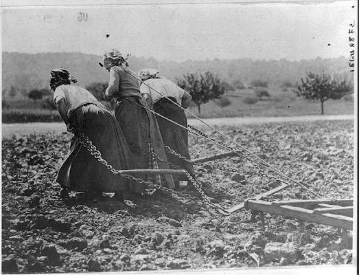
Peasants in the re-taken Somme District work hard without horses or cattle. The Germans in retreat have taken all livestock.
by unknown c. 1916. Library of Congress

    This was the original image of one of the more famous poster for the food movement, that the USFA or United States Food Administration would produce. while it doesn't carry well with the message that the USFA was trying to deliver it would still serve as a stark image to any farmer. They would be the ones most struck by its depressive state as they would be more in the know for how bad it had to be for the women of a farm manually plowing s field.

Heroic women of France, toiling to produce food
By United States Food Administration, c. 1917. Library of Congress

    The peace above was from some of the earlier work in the USFA that would be later done into the image below. While it being placed in the format of a poster it was considered to wordy, it didn't have the pop that the USFA and lacked the strong messaging that was needed at the time.


Will you help the women of France?
By Edward Penfield, New York, c. 1918. Library of Congress

    While the piece isn’t artistically of the best quality as it is a piece meant for print on mass in newspapers that would have access to the better technology in bigger cities for such a task. I think it represents the posters calling for America to restrict their use of food the best. There is a harsh tone in the women dragging along the plow, a device that was meant to be used by a horse or two, with the barren field around them. With the emptiness of the black canvas and the starkness of the message to save the wheat I think it stands strong in its messaging. With messaging and tone being some of the most important parts of propaganda pieces  it feels like all around the peace delivers fantastically.


    I also think that there is an importance in how the price is derived from an actual image from the French countryside. It is with how little the image changes in order to convey that message of need to America. While the starkness of the photo is important and could get the message across, I believe that it served as a better starting message when it was put in the poster form as it allowed for the direct message and the image to be better interlocked in the mind, instead of as just another headline piece. Thus it can be used as an individual poster with it also being mixed in with the newspapers. 

War Bonds

    America was already one of the economic superpowers of the modern world by WWI yet they didn’t want to anger their populace by greatly increasing the rate of taxation at the time. So instead they issued war bonds or liberty bonds as they were known in America and paid a good amount of money to create propaganda to sell the patriotic idea of the war bond. Oftentimes war bonds were focused on selling to the women of America as they were left in America and they tried to portray the war bonds as their patriotic duty. They were also more often put up in stores and in centers that women would frequent when compared to other forms of propaganda like the requitement propaganda. The messaging of such pieces would usually fall along the line of getting a dollar sent to the front, as a way to buy the supplies needed for the war. Another popular way to depict the reasoning for Americans to buy liberty bonds was that America itself was under threat and the way you could support it would be by buying the bonds.

    While America did specialize a branch in developing propaganda for the war bonds I believe the Allied countries did a better or at least more consistent call for war bonds as a whole. As it was the only way they could keep America's industrial complex in good standing with them. Germany and its allies however had done a great job in pushing their war bonds before the war actually begun, and thus let the German government accrue a mass of wealth that dwindled down during the war. With the state of Germany as it was being pushed back their later calls for the war bonds were thought by its citizens as a way to distribute toilet paper to the masses more than anything that the posters and pamphlets had to say.


You / Buy a Liberty Bond Lest I Perish, 1917, Charles Raymond Macauley

Artistically I’ll say it's in the art nuevo style with focus on recreating the imagery of the statue of liberty which it does fairly well and makes good use of the copper coloring that the statue is associated with. The work on the robe is good and that's where I end appreciation artistically for the piece. On the bad side the list stretches a bit more, the horns being to large and widely spaced, the torch not in use, the torch being placed in front of the robe thus distorting its symbolisms, the lean on the women as if she's been placed on a kilter, and finally the finger shape and angle is off with the whole rest of the body.


This piece of propaganda is one of the main reasons why I choose to focus on it and how WWI influenced a set of art due to its pure bold weirdness. I mean of all the angles you could choose, of all the depictions of the statue of liberty you could think of, this depiction of an angry mother boldly pointing at you as if you're in trouble with its poorly done hand gets me to smile upon sight every time. To go along with the painting that the lettering itself is backing is absurd as well. With the oddest choice of line spacing, then switching font three times, rotating the O in You and Bond, and the slant on the A. It just screams of absurdity and madness. I like to think it either slipped out of the pile of rejects, got handed off to the printers as a late switch up before a proper look or one of those wacky circumstances cause there is no way I'm producing that for propaganda. I'm not even hating on the idea of using the statue of liberty for the “liberty bond” because of the work below it drives me to wonder about the piece above even more.

“Hello! This is Liberty speaking.”

By Z. P. Nikolaki. New York 1918


    The piece is a major improvement as a whole in using the Statue of Liberty to get the women of America to go and donate and buy war bonds for the war as a whole. The messaging along the bottom is still a little unsatisfactory though that is more due to the large line after speaking more than anything else. I believe that going away from the copper green in the robes and using it as the background was a smart choice as it still keeps with the elements of the statue of liberty while better matching the women depicted. The loss of the torch for the telephone is a good idea as the jobs involving telephone lines involve mostly women and it speaks to the modern and young women more in general. The color change on the crown matches up better with the background as well, and while the horns are still a little on the wide side the gold brings attention to the poster while not drawing it fully. Overall a much better use of the statue of liberties depiction for the use of propaganda as a whole.

Recruitment

However the most famous piece of propaganda that was posted everywhere around America would be a recruiting poster. With the scale of the war that America was seeing occur in Europe they had recognized that the military would need a large expansion. In order to not only join in properly helping win the war but to also prepare forces for future conflict as the mass expansion of the Military would thus keep it at a higher average number of enlisted men after the war. To gather such a large number of men though they had to push for active recruiting  and calling for enlistment nationwide.


Uncle Sam Wants You

By James Montgomery Flagg, New York, 1916


    The poster itself was created from a magazine and held the catch phrase “What are you doing for Preparedness.”- Lesley Magazines. It was also done in the image of the author himself which is funny as many people who when asked who the portrait is set to resemble often think of one of the more famous  presidents, such as Lincoln or Washington. This piece would go on to popularize the American government's connection with “Uncle Sam” as well as inspire many satirical artists in later years in their depictions of the American government.

    The piece itself, while being a self portrait, falls under the Art Nouveau style due to the popping color usage, its use in media, and the strong message it conveys. The work as a piece of art is interesting as the way in which most of the shape lines are broken up by the long brush strokes gives a stronger shape to the character. The shaping of the piece with the under shirt shadows and the shoulders all hold a roundness and draws the observer to the center of the poster. The usage of the fade along the right side of the painting is also interesting as the figure disappears completely, but with how simple the left arm is you don't even notice it at first glance. Then in the center of the piece with the level higher detail the eye feels focused in on the finger. It is an interesting use of contrast that highlights the center by a good margin.

    Personally it is the contrast through levels of detail that I enjoy the most about the piece as it draws the eye so much that I hadn’t even noticed the almost forgotten left arm hadn’t even been painted on until I blew the peace up to better examine it. I also love the Art Nouveau style as it holds a great influence on the comics that would occur due to propaganda throughout the world.


Cook, Jia-Rui. “The Posters That Sold World War I to the American Public.”

Smithsonian, Smithsonian.com, 28 July 2014,

https://www.smithsonianmag.com/history/posters-sold-world-war-i-american-public-180952179/ .

evolempirecreative. “Women of the Great War: WWI Posters.” History Nebraska, 29 Oct. 2022, https://libarchives.unl.edu/project/ww1-posters/

“Great Posters of the Great War |

Archives & Special Collections, University of Nebraska-Lincoln.” University Libraries,

https://libarchives.unl.edu/project/ww1-posters/.

“Selling the War.” How WWI Changed America, 2024, wwichangedus.org/topics/selling-the-war/.

“World War Wednesday: Women & Wheat.” THE FOOD HISTORIAN, https://www.thefoodhistorian.com/blog/world-war-wednesday-women-wheat.


Tuesday, March 25, 2025

Romantism vs Impressionism

    I have chosen to compare the works of romanticism artists and impressionist artists, and i choose these two styles of art as I simply enjoy them the most out of the styles in the Victorian era. For romanticism it feels as if we can finally see the start of some high fantasy artists as we know it to be today with the grand portrayal of scene and character. With impressionist artists they are taking the very real world often and bringing a life to a picture that is normally difficult to find in the real world. The pieces I have picked for Romanticism are Wanderer above the sea fog by Casper David Friedrich 1818, and Desolation 5th part of the series The course of an empire by Thomas Cole. As for the impressionist pieces I have chosen The Cliff at Etretat after the storm by Claude Monet 1885 and Sunrise at ivry by Armand Guillaumin 1873.

Romanticism- 


Wanderer above the sea fog

By Casper David Friedrich, 1818


This is my favorite of the four chosen paintings. In my mind it is the way it sets the man facing the sea against the world itself and he stands in challenge to it with a will and pride that the waves simply cannot wash away. It is in how he is centered on the piece taking up just enough of the portrait to stand out against the waves. Yet even with his centered presence there is enough open space around him to display the power that is backing the ocean. The use of light within the piece feels excellent as well as he stands out so strikingly against the white foreground yet he is not simply shaded in with black but a green that stands sharply with the rocks and the edges of his suite.


When I compare a Romantic piece of art like this to Impressionism I first look for movement in the scene. It is firstly in the movement of the waves that one of the strongest oppositions to impressionism is made. The power and uncontrolled nature of the waves granted by the feeling of movement is able to sharpen the emotions that are trying to display as a whole. 


The connection that I personally feel for the piece and why it is my favorite out of the four I choose is that it reminds me of a book series. The way in which the man is starting out into the sea as if he is all that is left and yet it doesn’t matter reminds me of Rand Al’Thor from the Wheel of Time by Robert Jordan.  To mee it is as if the character made in the book series that began releasing 70 years later perfectly fits into the role that the man upon the rock is portraying. I just don’t know another way to describe it than a puzzle piece from another set going perfectly into the puzzle and simply making the end result better.


Desolation, 5th part of the series, The Course of an Empire

By Thomas Cole 1836


Here again we have a single figure standing in the face of the world before it yet in the piece Desolation it is not with pride and will power to face it down. Instead it is the final piece of a memory standing against time as it creeps up on it. In the foreground the moon is rising signifying the end to an era that will only be known in myth. The landscape that once was dominated by human hands being stripped away and returned into nature. With the ocean so vast before the column showing just how tiny of a part it played in the story of the world that dwarfs whatever was there before.


Desolation is the final part of a five painting set done by Thomas Cole that goes through the rise and fall of a grecian/roman empire. It was originally meant to be sat around a fireplace  with the Desolation sitting at the bottom right of the set. The pieces do an amazing job of displaying what Romanticism is about and just how broad of a form the style can show in both larger scale landscapes and city wide spread full of movement of people and goods. I chose Desolation specifically as it displays a level of stillness not found in the other parts of the series yet it still holds on to the story that it is trying to tell.

Use of spacing and in how the empty voids are filled hold the greatest importance of the romantic landscape piece that is displayed. The clouds also being pushed to the side opens the landscape even further as the water and sky fade into each other. In using darker colors for the ocean and the darker greens for the plant life Thomas Cole keeps the depressing mood that he is trying to acquire with the empty spaces that the architecture in the piece use to hold. The colors of the marble feels faded and adds to the age of the buildings within the piece. Though the use of lighting feels off slightly as it is hard to distinguish the moon as being separate from sun at first glance. Finally we are able to get a hard look at the column itself showing how even though it is still standing it is still begging to crumble with how aged  it appears. The column is one of the most important parts of the peace as it draws immediate attention to what used to be there and not just the greater landscape.

Impressionism-
The cliff at Etretat after the storm
By Claude Monet 1885

I chose The Cliff at Etretat after the storm as it is a piece that can carry itself well in digital form though I will get into that later. The piece makes interesting use of shading as in the process of making the piece the artist would paint on  more layers with the paint underneath still being wet. This means that most of the blending occurs naturally due to the brush stroke itself and enhances the greens and blues in the ocean especially. Impressionist pieces often feel like photos with how still the movement within the price is yet with how the Monet did the mixing within this piece you can easily imagine movement within the waves themselves as they creep up on the beach. HIs use of color is also enjoyable as the stark copper greens against the cliff give the impression of life to the still rock faces as if they are moving with the ocean. His use in lighting gives a good impression in the piece through the middle offshoot does appear a bit darker than it should. I think this is due to how the offshoot of a cliff doesn't appear as far back or tucked behind the right cliff face as it should.

I enjoy the peace as the grey cliffs are spruced with these bright flashes of color that catch the eye and draw attention to the boulder that is spruced with flashes of white, red, and yellow.

The Artists wish to display a place from his youth is nice and it plays in well with the friend he made in the area who was also taken with the cliffs, that being one Guy de Maupassant. The effort taken to make such a piece as well as not only would have to rush in and out of the area due to tidal work but as he made it during the winter the paints would have been a difficulty to work properly in the cold.


Sunrise at ivry
By Armand Guillaumin 1873

I choose Sunrise at Irvy  due to the use of sharp lines that is not often found in many impressionist works and I believe it is due to the message that the artist Armand Guillaumin wanted to display. The message being the factories are destroying the natural beauty of what nature has provided. The artists themselves show in both their writings and other pieces of art a leaning towards the Romantics so that comes as no surprise. It is their use of this style of painting to disparage factories that I found interesting though.  As we often see, impressionism is used to display the beauty of the world around the artist be it in people or landscape with the use of colors and painting techniques. The counter point thus being made by Guillaumin using impressionism thus stands out much stronger than it would have if he did it in let's say realism.


If you remove the factories and their effects on the landscape it is a nice painting that makes good use of color and shading in the impressionistic style. Though spacing would be off without the smoke as there would be too much empty sky for it to be considered a nicer piece in the style. Yet with filling the background with the sharp lines of the factories and the smoke that they produce the effects  stand out that much more. There is a pop to the factories themselves as they stand tall against the rest of the skyline in contrast to the many buildings both around and in front of them. The blocking of the sun also plays a nice touch as he is able to make the foreground much darker and depressing reasonably instead of having it bathed in the nice lighting effects that the sun would require for such a piece, The color use in the water is also nice as the blue stand sharply against an almost polluted looking yellow.


Final Comparison and thoughts-

I did not enjoy Impressionist work as much as I thought I would, which feels disappointing as they inspired Van Gough and led to many of his greatest works. This may be due to it being the digital format though as I did see some wonderful impressionist pieces at the Van Gogh museum. I think that without the rise and the texture that is displayed with the actual impressionist pieces they lack the flare. I think that is also because as you move around a piece painted in the impressionist style it can change ever so slightly as you are seeing the painted dots at different angles.

In both of the romantic pieces there is a movement being openly displayed and calling for attention. For the Wanderer in the Fog that movement is the waves crashing against the cliffs as a display of power and force that nature holds. In the Desolation there is a flow and life that I feel like a six sense being that the world around the building and pillar is alive and not dead or dying. Movement itself is one of the basic parts of judging art and between Romantic and Impressionist pieces the impressionist pieces feel like photos with the lack of it within the frame. In the Cliff at Etretat after the storm there simply is none of the life one is expected to see after that storm which thus in naming one feels off put. Then if you look upon the water even though the pieces main drawing point is meant to be the flow within the waves it simply isn’t there. There isn’t any of the foam one expects at the top of each wave, there isn’t unity within the movement of the water that is expected of the ocean, and the paddle boat coming into the bay could just as easily be rocks for how much the water looks to have affected it. I think it is a part of the impressionistic style that was lacking in the early days and would be brought up with Van Gogh's work and how they flow but until then Impressionism feels dead with how lacking that movement element is within the pieces.

Secondly I think Romanticism is a hard painting style to out due for me because of what it is trying to display compared to what impressionism is trying to display. If i were to describe the first thing that comes to my mind when i think of the Victorian era as it is more famously known as i am usually thinking of the commerce and the exploration of the united states along with an almost steampunk vibe from England. There is also the end of the feudalistic era occurring thus there is a last push for the holds that the old stories from the Romans and knights have on the artistic populace. When I think of Impressionistic art I mostly associate it with the start of a form of art. I think that impressionism for the most part was simply to know of an art form for too long of a time and that it was what led into the era of shape art. I think my negative connotation of what leads after impressionism affected my view of the art form itself at the end of the day. 

Finally I think that impressionism lacks a step back in painting things when you look at a piece over the screen instead of in person. There is a lack of the rise and shadows that the impressionist pieces rely so much on over the screen format. The texturing that you sense with other pieces isn’t there online for impressionistic pieces as it is the paint itself and not the way the lines are made in the piece if that makes sense. I guess it's like if you put puff paints on a shirt but when you took a photo of that shirt none of the rise or 3-d-ness of the paint was there.


Sunset at Ivry by GUILLAUMIN, Armand. (n.d.). Retrieved from www.wga.hu website: https://www.wga.hu/html_m/g/guillau/03guilla.html

The Cliffs at Etretat, 1885 by Claude Monet. (n.d.). Retrieved from https://www.claude-monet.com/the-cliffs-at-etretat.jsp

The Course of Empire (paintings). (2021, July 6). Retrieved from Wikipedia website: https://en.wikipedia.org/wiki/The_Course_of_Empire_(paintings)

Wikipedia Contributors. (2019, January 21). Wanderer above the Sea of Fog. Retrieved from Wikipedia website: https://en.wikipedia.org/wiki/Wanderer_above_the_Sea_of_Fog


Random Collection of post modern "Art"

  Ok so first I couldn’t decide what I wanted to do for this time period simply because it is so large and the evolution of so many styles o...