Propaganda and Americas Usage
Propaganda is a form of art that I find to be one of my favorites especially when it gets to the World Wars. Before the World Wars propaganda had been often depicted in black and white format and was especially popular in newspapers and pamphlets. This is especially true in Europe as they were either downplaying the colonies or it was being used as a form of expression on their rival countries or the inner workings of their own politics. However there is a change in propaganda around the first world war. Not only stylistically, but with the messaging being used by the governments themselves. Some of the pieces that got stronger support by the governments would also go on to later influence how countries often view themselves today.
American propaganda holds a level of variety that the nations involved with the war from the start. This is due in large part due to the disconnection that America had with the war itself as much of it was being fought in Europe and the colonies which those countries held. So America had to push hard to gain public support for the war, and to get over that hurdle of an unenthused populous populace.
The first stages of propaganda focused on the economic issues that the war was placing Europe in. This included the lack of weapons to keep the war going and the lack of proper food stuff across Europe. Then America shifted focus to become a more active member in the war. Thus the focus around the war bond or liberty bond as they were better known as. A way for private citizens to pay the government in wartime and thus better support the war effort, the bonds can be cashed in at a later date. The use of recruitment ads, the dehumanization of the German people, and the call for women in to join in with the American workforce. Came about more strongly as American Finally began taking a full on active role within the WWI in 1917.
Food Stuffs
Will you help the women of France? Is a piece of propaganda looking to influence American farmers as the U.S. Government didn’t and couldn’t enforce what farmers were growing across the country. So goods like meat, fruits, and most especially wheat were depicted in many posters as being goods that the American people should refrain from consuming as much of. Wheat was of great importance as it was one of the easiest and best ways to feed continental Europe especially with a majority of European wheat being destroyed in Ukraine or being locked up in India due to German U-boats.
America didn’t have an excess of wheat stored up to support Europe as in 1915 and 16 the fields had poor harvests. The scarcity of the wheat and the need for the farmers to recoup those earlier losses led to farmers trying to not grow in excess and they didn’t produce the wheat at the levels the Government wanted them to. So it was of great importance to encourage the American people to not only consume less but to grow more.


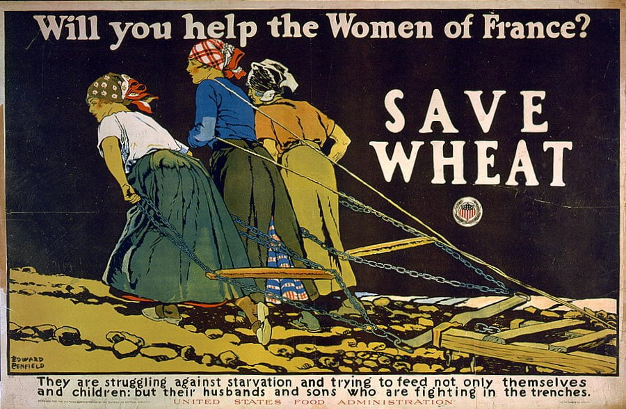
While the piece isn’t artistically of the best quality as it is a piece meant for print on mass in newspapers that would have access to the better technology in bigger cities for such a task. I think it represents the posters calling for America to restrict their use of food the best. There is a harsh tone in the women dragging along the plow, a device that was meant to be used by a horse or two, with the barren field around them. With the emptiness of the black canvas and the starkness of the message to save the wheat I think it stands strong in its messaging. With messaging and tone being some of the most important parts of propaganda pieces it feels like all around the peace delivers fantastically.
I also think that there is an importance in how the price is derived from an actual image from the French countryside. It is with how little the image changes in order to convey that message of need to America. While the starkness of the photo is important and could get the message across, I believe that it served as a better starting message when it was put in the poster form as it allowed for the direct message and the image to be better interlocked in the mind, instead of as just another headline piece. Thus it can be used as an individual poster with it also being mixed in with the newspapers.
War Bonds
America was already one of the economic superpowers of the modern world by WWI yet they didn’t want to anger their populace by greatly increasing the rate of taxation at the time. So instead they issued war bonds or liberty bonds as they were known in America and paid a good amount of money to create propaganda to sell the patriotic idea of the war bond. Oftentimes war bonds were focused on selling to the women of America as they were left in America and they tried to portray the war bonds as their patriotic duty. They were also more often put up in stores and in centers that women would frequent when compared to other forms of propaganda like the requitement propaganda. The messaging of such pieces would usually fall along the line of getting a dollar sent to the front, as a way to buy the supplies needed for the war. Another popular way to depict the reasoning for Americans to buy liberty bonds was that America itself was under threat and the way you could support it would be by buying the bonds.
While America did specialize a branch in developing propaganda for the war bonds I believe the Allied countries did a better or at least more consistent call for war bonds as a whole. As it was the only way they could keep America's industrial complex in good standing with them. Germany and its allies however had done a great job in pushing their war bonds before the war actually begun, and thus let the German government accrue a mass of wealth that dwindled down during the war. With the state of Germany as it was being pushed back their later calls for the war bonds were thought by its citizens as a way to distribute toilet paper to the masses more than anything that the posters and pamphlets had to say.

You / Buy a Liberty Bond Lest I Perish, 1917, Charles Raymond Macauley
Artistically I’ll say it's in the art nuevo style with focus on recreating the imagery of the statue of liberty which it does fairly well and makes good use of the copper coloring that the statue is associated with. The work on the robe is good and that's where I end appreciation artistically for the piece. On the bad side the list stretches a bit more, the horns being to large and widely spaced, the torch not in use, the torch being placed in front of the robe thus distorting its symbolisms, the lean on the women as if she's been placed on a kilter, and finally the finger shape and angle is off with the whole rest of the body.
This piece of propaganda is one of the main reasons why I choose to focus on it and how WWI influenced a set of art due to its pure bold weirdness. I mean of all the angles you could choose, of all the depictions of the statue of liberty you could think of, this depiction of an angry mother boldly pointing at you as if you're in trouble with its poorly done hand gets me to smile upon sight every time. To go along with the painting that the lettering itself is backing is absurd as well. With the oddest choice of line spacing, then switching font three times, rotating the O in You and Bond, and the slant on the A. It just screams of absurdity and madness. I like to think it either slipped out of the pile of rejects, got handed off to the printers as a late switch up before a proper look or one of those wacky circumstances cause there is no way I'm producing that for propaganda. I'm not even hating on the idea of using the statue of liberty for the “liberty bond” because of the work below it drives me to wonder about the piece above even more.

“Hello! This is Liberty speaking.”
By Z. P. Nikolaki. New York 1918
The piece is a major improvement as a whole in using the Statue of Liberty to get the women of America to go and donate and buy war bonds for the war as a whole. The messaging along the bottom is still a little unsatisfactory though that is more due to the large line after speaking more than anything else. I believe that going away from the copper green in the robes and using it as the background was a smart choice as it still keeps with the elements of the statue of liberty while better matching the women depicted. The loss of the torch for the telephone is a good idea as the jobs involving telephone lines involve mostly women and it speaks to the modern and young women more in general. The color change on the crown matches up better with the background as well, and while the horns are still a little on the wide side the gold brings attention to the poster while not drawing it fully. Overall a much better use of the statue of liberties depiction for the use of propaganda as a whole.
Recruitment
However the most famous piece of propaganda that was posted everywhere around America would be a recruiting poster. With the scale of the war that America was seeing occur in Europe they had recognized that the military would need a large expansion. In order to not only join in properly helping win the war but to also prepare forces for future conflict as the mass expansion of the Military would thus keep it at a higher average number of enlisted men after the war. To gather such a large number of men though they had to push for active recruiting and calling for enlistment nationwide.

Uncle Sam Wants You
By James Montgomery Flagg, New York, 1916
The poster itself was created from a magazine and held the catch phrase “What are you doing for Preparedness.”- Lesley Magazines. It was also done in the image of the author himself which is funny as many people who when asked who the portrait is set to resemble often think of one of the more famous presidents, such as Lincoln or Washington. This piece would go on to popularize the American government's connection with “Uncle Sam” as well as inspire many satirical artists in later years in their depictions of the American government.
The piece itself, while being a self portrait, falls under the Art Nouveau style due to the popping color usage, its use in media, and the strong message it conveys. The work as a piece of art is interesting as the way in which most of the shape lines are broken up by the long brush strokes gives a stronger shape to the character. The shaping of the piece with the under shirt shadows and the shoulders all hold a roundness and draws the observer to the center of the poster. The usage of the fade along the right side of the painting is also interesting as the figure disappears completely, but with how simple the left arm is you don't even notice it at first glance. Then in the center of the piece with the level higher detail the eye feels focused in on the finger. It is an interesting use of contrast that highlights the center by a good margin.
Personally it is the contrast through levels of detail that I enjoy the most about the piece as it draws the eye so much that I hadn’t even noticed the almost forgotten left arm hadn’t even been painted on until I blew the peace up to better examine it. I also love the Art Nouveau style as it holds a great influence on the comics that would occur due to propaganda throughout the world.
Cook, Jia-Rui. “The Posters That Sold World War I to the American Public.”
Smithsonian, Smithsonian.com, 28 July 2014,
https://www.smithsonianmag.com/history/posters-sold-world-war-i-american-public-180952179/ .
evolempirecreative. “Women of the Great War: WWI Posters.” History Nebraska, 29 Oct. 2022, https://libarchives.unl.edu/project/ww1-posters/
“Great Posters of the Great War |
Archives & Special Collections, University of Nebraska-Lincoln.” University Libraries,
https://libarchives.unl.edu/project/ww1-posters/.
“Selling the War.” How WWI Changed America, 2024, wwichangedus.org/topics/selling-the-war/.
“World War Wednesday: Women & Wheat.” THE FOOD HISTORIAN, https://www.thefoodhistorian.com/blog/world-war-wednesday-women-wheat.


I really like how you chose war propaganda, I don't think I would have even thought about that. I think that propaganda posters were art in a way, but not exactly what my mind thinks of when I think of art.
ReplyDelete